

Building an Autocomplete/Typeahead Component with AlpineJS and Livewire
Chris Di Carlo • October 29, 2020
Introduction
The concept was simple: build an autocomplete (or if you prefer, typeahead) text input for a project I was working on but using only AlpineJS and Livewire.
Fast forward a couple of weeks, multiple runs of nah (git reset --hard && git clean -df), umpteen cups of coffee, too many web searches to quantify, and I find myself in that sublime state of mind knowing that I finally have a working component.
It's by no means complete or probably as elegant as it could be; as I got near the finish line and started to feel the itch to start refactoring, I pulled my fingers away from the keyboard and reflected on what I had: a working, yes, working!!, component. Any refactoring can go into the next iteration if I feel the need and/or pain. But for now... STEP...AWAY...FROM...THE KEYBOARD!
Since I had so much trouble getting the darn thing to work and wrapping my head around how to tackle the problem, I figured I would share how I did it.
Note - this post is going to use some features only available in AlpineJS 2, namely entanglement. Make sure your dependencies are up to date!
Enjoy!
Overview
The solution consists of a base Livewire component and it's associated Blade template. To use it, you extend that component and implement the query() method to specify the data to display. Optionally, you can listen for an event fired from the base component and pass that up the chain - I'll get to that in a moment.
Let's See Some Code
To make things simple, the example is going to be making use of the standard Eloquent User model that ships with Laravel but in reality it could be anything. The only requirement with this implementation as it stands now is that it must have a 'name' and 'id' field - how those values are resolved doesn't matter but those will be the properties displayed and forwarded up the event chain.
The Base Component
The base component is an abstract class with most of the functionality except for the data retrieval itself.
abstract class Autocomplete extends Component
{
    public $results;
    public $search;
    public $selected;
    public $showDropdown;

    abstract public function query();

    public function mount()
    {
        $this->showDropdown = false;
        $this->results = collect();
    }

    public function updatedSelected()
    {
        $this->emitSelf('valueSelected', $this->selected);
    }

    public function updatedSearch()
    {
        if (strlen($this->search) < 2) {
            $this->results = collect();
            $this->showDropdown = false;
            return;
        }

        if ($this->query()) {
            $this->results = $this->query()->get();
        } else {
            $this->results = collect();
        }

        $this->selected = '';
        $this->showDropdown = true;
    }

    public function render()
    {
        return view('livewire.autocomplete');
    }
}
Nothing too crazy here. The component initializes the list of results to an empty collection and the dropdown open state. The updatedSelected() method triggers when the user selects an item from the list and emits an event to itself with the selected ID (you'll see why in a moment). The updatedSearch() method handles checking to make sure the query doesn't run until the user provides at least 2 characters in the search term and handles triggering the opening of the search results dropdown.
The Subclass
The subclass is fairly simple. It just needs to implement the abstract method query() from the base class and optionally, listen for the valueSelected event emitted from the base class:
class UserAutocomplete extends Autocomplete
{
    protected $listeners = ['valueSelected'];

    public function valueSelected(User $user)
    {
        $this->emitUp('userSelected', $user);
    }

    public function query() {
        return User::where('name', 'like', '%'.$this->search.'%')->orderBy('name');
    }
}
The key pieces to notice in this class are the query() method and the valueSelected() listener. The query() method let's you retrieve the data for the autocomplete any way you like - Eloquent, collection, array, whatever you want. The valueSelected() listener is interesting - it listens for an event fired from the base class and allows you to fire other events, in this case firing a userSelected event up to the parent component. It's interesting because it lets the event names being listened to in the parent component be tied more directly to the business domain and I think it makes the code a bit easier to grok but that's obviously subjective!
The View
But now let's get to the meat of the thing - here's the Blade view for the component. All of the unessential attributes have been removed to make it easier to see the important bits.
<div>
  <div
    x-data="{
      open: @entangle('showDropdown'),
      search: @entangle('search'),
      selected: @entangle('selected'),
      highlightedIndex: 0,
      highlightPrevious() {
        if (this.highlightedIndex > 0) {
          this.highlightedIndex = this.highlightedIndex - 1;
          this.scrollIntoView();
        }
      },
      highlightNext() {
        if (this.highlightedIndex < this.$refs.results.children.length - 1) {
          this.highlightedIndex = this.highlightedIndex + 1;
          this.scrollIntoView();
        }
      },
      scrollIntoView() {
        this.$refs.results.children[this.highlightedIndex].scrollIntoView({
          block: 'nearest',
          behavior: 'smooth'
        });
      },
      updateSelected(id, name) {
        this.selected = id;
        this.search = name;
        this.open = false;
        this.highlightedIndex = 0;
      },
  }">
  <div
    x-on:value-selected="updateSelected($event.detail.id, $event.detail.name)">
    <span>
      <div>
        <input
          wire:model.debounce.300ms="search"
          x-on:keydown.arrow-down.stop.prevent="highlightNext()"
          x-on:keydown.arrow-up.stop.prevent="highlightPrevious()"
          x-on:keydown.enter.stop.prevent="$dispatch('value-selected', {
            id: $refs.results.children[highlightedIndex].getAttribute('data-result-id'),
            name: $refs.results.children[highlightedIndex].getAttribute('data-result-name')
          })">
      </div>
    </span>

    <div
      x-show="open"
      x-on:click.away="open = false">
        <ul x-ref="results">
          @forelse($results as $index => $result)
            <li
              wire:key="{{ $index }}"
              x-on:click.stop="$dispatch('value-selected', {
                id: {{ $result->id }},
                name: '{{ $result->name }}'
              })"
              :class="{
                'bg-indigo-400': {{ $index }} === highlightedIndex,
                'text-white': {{ $index }} === highlightedIndex
              }"
              data-result-id="{{ $result->id }}"
              data-result-name="{{ $result->name }}">
                <span>
                  {{ $result->name }}
                </span>
            </li>
          @empty
            <li>No results found</li>
          @endforelse
        </ul>
      </div>
    </div>
  </div>
</div>
Whoa! A lot going on there. Let's break it down.
<div>
    <div x-data="{
        open: @entangle('showDropdown'),
        search: @entangle('search'),
        selected: @entangle('selected'),
        highlightedIndex: 0,
        ...
The first couple of lines declare a new Alpine component scope and provide some initialization. Note that it's using the new @entangle feature from AlpineJS v2. This syncs the Livewire properties with the AlpineJS attributes automagically. HighlightedIndex tracks the currently highlighted option when navigating the results list using a keyboard.
...

highlightPrevious() {
    if (this.highlightedIndex > 0) {
        this.highlightedIndex = this.highlightedIndex - 1;
        this.scrollIntoView();
    }
},
highlightNext() {
    if (this.highlightedIndex < this.$refs.results.children.length - 1) {
        this.highlightedIndex = this.highlightedIndex + 1;
        this.scrollIntoView();
    }
},
scrollIntoView() {
    this.$refs.results.children[this.highlightedIndex].scrollIntoView({
        block: 'nearest',
        behavior: 'smooth'
    });
},
updateSelected(id, name) {
    this.selected = id;
    this.search = name;
    this.open = false;
    this.highlightedIndex = 0;
},

...
Next are the functions to handle tracking the currently highlighted option, scroll it into view, and update the selected value. It also handles the edge cases when the user hits the top or bottom of the list. The $refs.results references an x-ref directive on the "ul" element holding the list items and allows access to it's children. In a second you'll see another way it's used that makes the keyboard navigation sing.
<div x-on:value-selected="updateSelected($event.detail.id, $event.detail.name)">
The next piece of the puzzle: the value-selected custom event Alpine listener on the container div. It simply passes the id and name to the previously mentioned updatedSelected() Javascript function to set the values and clean up a bit. This will be important in a minute.
<input
    wire:model.debounce.300ms="search"
    x-on:keydown.arrow-down.stop.prevent="highlightNext()"
    x-on:keydown.arrow-up.stop.prevent="highlightPrevious()"
    x-on:keydown.enter.stop.prevent="$dispatch('value-selected', {
        id: $refs.results.children[highlightedIndex].getAttribute('data-result-id'),
        name: $refs.results.children[highlightedIndex].getAttribute('data-result-name')
    })"
    >
Onward we march! Now it's starting to get interesting. The input element has a couple of Alpine event handlers and also a wire:model to set up Livewire data-binding. You can probably guess what the x-on:keydown handlers do from the names and the functions they call. The x-on:keyboard.enter event, however, does something sneaky: it dispatches an Alpine event called value-selected (remember when I said it would be important?) and passes in a Javascript object with the id and name. The neat thing is that it grabs those values from data- props on the list elements; they are set when the data is rendered in the @forelse loop - which you'll see next - specifically so they can be used in this way if the user selects the entry using the keyboard.
<div
  x-show="open"
  x-on:click.away="open = false">
    <ul x-ref="results">
      @forelse($results as $index => $result)
        <li
          wire:key="{{ $index }}"
          x-on:click.stop="$dispatch('value-selected', {
              id: {{ $result->id }},
              name: '{{ $result->name }}'
          })"
          :class="{
              'bg-indigo-400': {{ $index }} === highlightedIndex,
              'text-white': {{ $index }} === highlightedIndex
          }"
          data-result-id="{{ $result->id }}"
          data-result-name="{{ $result->name }}">
            <span>
              {{ $result->name }}
            </span>
        </li>
      @empty
        <li>No results found</li>
      @endforelse
    </ul>
</div>
And last but not least, the dropdown itself. It has the typical x-show and x-on:click.away to trigger the opening and closing of the item list. Also notice the x-ref mentioned previously to allow grabbing the element from Javascript.
The meat of this code lies within the @forelse loop: each element is displayed and wire:key is used to make sure Livewire can keep track of things properly. The x-on:click handler again dispatches an Alpine custom event just like on the input element - the only difference is here the values are directly available using good-old Blade syntax. Next the two data-properties are assigned; this allows the previously mentioned x-on:keydown.enter event on the input element to grab those values. The last piece is the dynamic Alpine :class attribute to facilitate highlighting the currently selected index during keyboard navigation; the hover states on mouseover are handled using TailwindCSS' hover utilities.
The End Result
After all that, the moment of truth! Here's a look at the completed component in action:
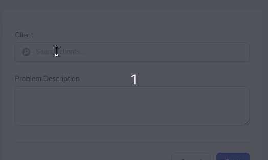
Pretty cool, eh?